Macro clouds remain on the horizon.
Wherever you look at, you see unsustainable economic models: we are either relying on debt-fueled growth (US), trying to squeeze exhausted growth models (China), or succumbing to a slow and painful death (Europe).
Today, let’s take a step back and talk about the business models that Europe and the US are pursuing.
Let’s unpack them together, and understand what lies ahead and how to prepare portfolios accordingly.
Europe is slowly dying.
To prove my point, here is one of the most depressing chart you’ll see today:
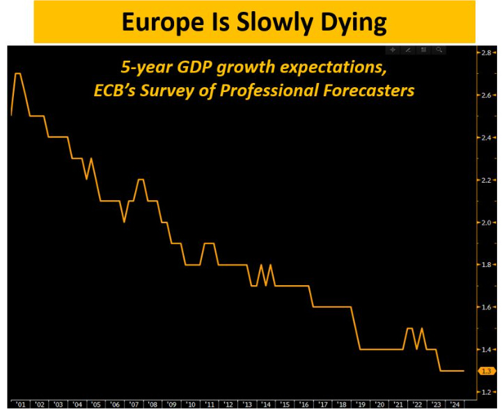
The chart above shows an uncomfortable truth for Europe.
ECB’s Professional Forecasters now expect 5-year growth in Europe to come in at only 1.3% – the lowest level ever. Before the Great Financial Crisis, this number used to be consistently above 2.0% in real terms.
So while we are talking about the ”Roaring 20s” for the US, and while we are watching countries like India perform particularly well we are left to answer some tough questions in Europe.
Why is growth so low, and expected to remain so sluggish?
- An imperfect European infrastructure, and no improvement in sight: we run a ”union” under one monetary policy, different fiscal policies, and without a banking or capital markets union.
- Poor productivity, and no structural reforms: while touted the whole time, European politicians are not busy with reforms to structurally improve productivity.
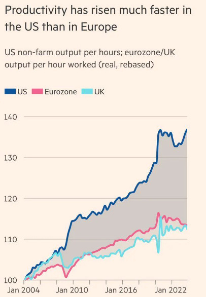
Over the last 20+ years, European productivity growth has been a meager ~1% per year.
The US is becoming increasingly more productive at a much faster pace:
3. Bad demographics, and worsening;
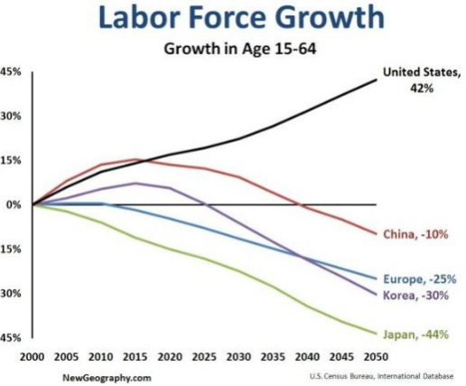
Low birth rates imply that Europe will see its labor force shrink by 25% (!) over the next 20-30 years:
Not only that – it’s also a matter of putting people to work in the first place.
In Italy, women’s labor force participation rate is not even at 60%.
4. No appetite for true innovation, and instead an insatiable appetite for more and more regulation

Europe is slowly dying.
Yet markets are still in La-La Land.
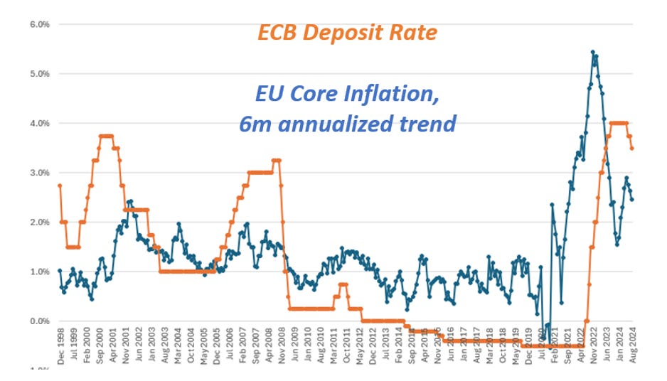
This week, the cut interest rates once again but nominal rates remain still too high versus the underlying trend in .
As the chart below shows, Europe instead needs interest rates below (!) the level of inflation to have a monetary policy loose enough to stimulate at least some growth:
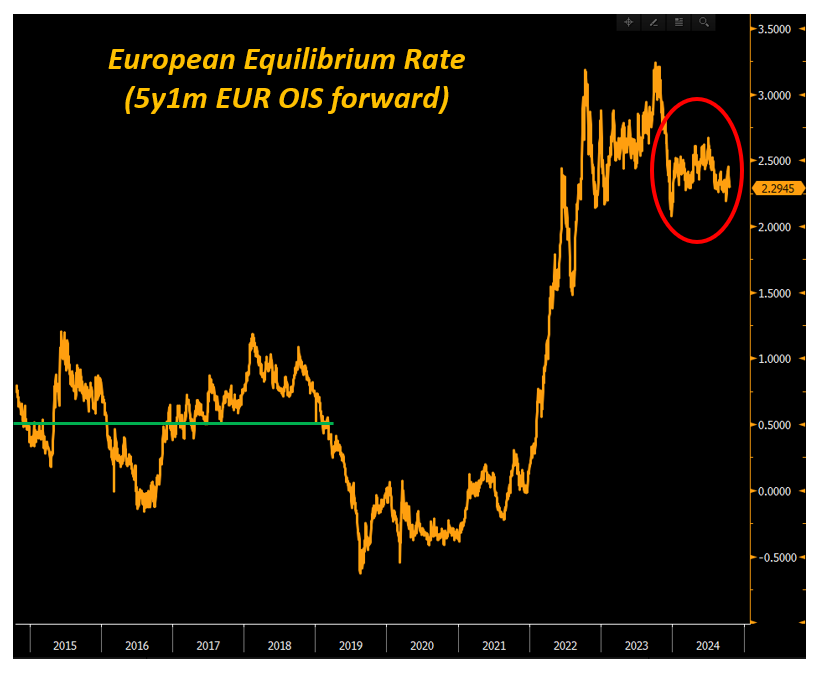
The chart below is another way to picture this inconsistent bond market pricing.
The long-run equilibrium nominal rate represents the nominal interest rate that allows an economy to operate smoothly and deliver its potential growth rate while inflation hovers around 2%.
Think of it like the interest rate which ‘‘balances’’ the economy.
Before the pandemic, the average pricing for the long-run equilibrium nominal rate in Europe was +0.5%.
Today, it’s over +2.0%.
What has changed in Europe so that the economy can structurally handle higher interest rates way better than before the pandemic?
In my opinion: nothing.
If anything, things look a bit worse now:
Patient Europe is dying.
Better make sure your portfolio is prepared for it.
Let’s chat about the US economic model now.
Here are some staggering statistics about the US economy – since mid-2020:
1) US nominal has grown by ~7 trillion
2) US total debt has grown by ~8.5 trillion
Debt-fueled economy, debt-fueled growth:
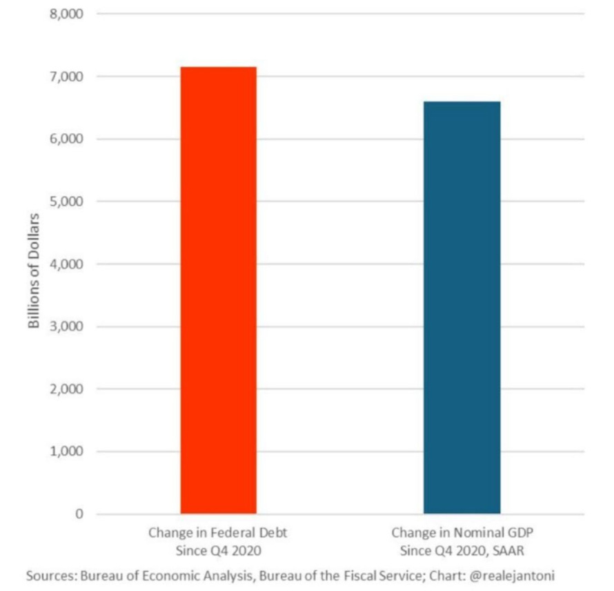
Look at this excellent chart from E.J. Antoni.
It shows how US nominal growth (blue) has increased less than the increase in federal government debt (red).
If you add in private sector debt, the red bar crosses the 8 trillion mark.
Should we worry about this debt-fueled growth model?
Look: our monetary system is centered around debt/credit creation to sustain economic growth. There is nothing inherently bad about that, but the key is to use new debt to fund productive investments and reforms.
We got worse and worse at that:
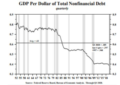
As the chart above shows, for every new $ of debt we end up creating way less than a new $ of GDP growth.
So: yes, the US economy has done incredibly well since 2020.
But more than organic growth, this is once again debt-fueled growth.
Whoever wins the US Presidential Elections, you can rest assured there will be more and more debt creation to try and fuel US economic growth.
Can this model continue to thrive?
I’ll cover this in next week’s flagship US election research piece.
Disclaimer: This article was originally published on The Macro Compass. Come join this vibrant community of macro investors, asset allocators and hedge funds – check out which subscription tier suits you the most using this link.

