This week, the spotlight will be on inflation, with key indicators such as the (CPI), (PPI), / prices, and the University of Michigan’s 5-10 year scheduled for release. The June projections show a year-over-year increase of 3.1% for June, compared to 4.0% in May. However, primary attention will continue to be directed toward the core CPI, which is anticipated to show a rise of 5% versus the 5.3% increase reported in May.
The June CPI figure is projected to be the lowest print for the index in the coming months. Inflation swaps anticipate a rise in headline inflation during July and August, followed by stabilization at around 3% for the remainder of the year. This only holds true assuming commodity prices remain steady and refrain from increasing again, as any rise could potentially bring upside to this inflation swap projection.

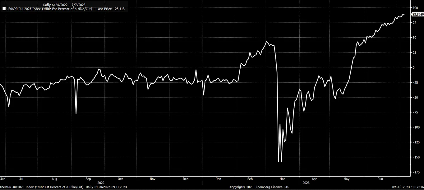
Currently, the market is factoring in approximately a 90% probability that the Federal Reserve will increase rates at the July Federal Open Market Committee (FOMC) meeting. Unless the CPI report significantly underperforms expectations, considering the recent labor market data, a rate hike in the July FOMC meeting appears to be the most plausible scenario.
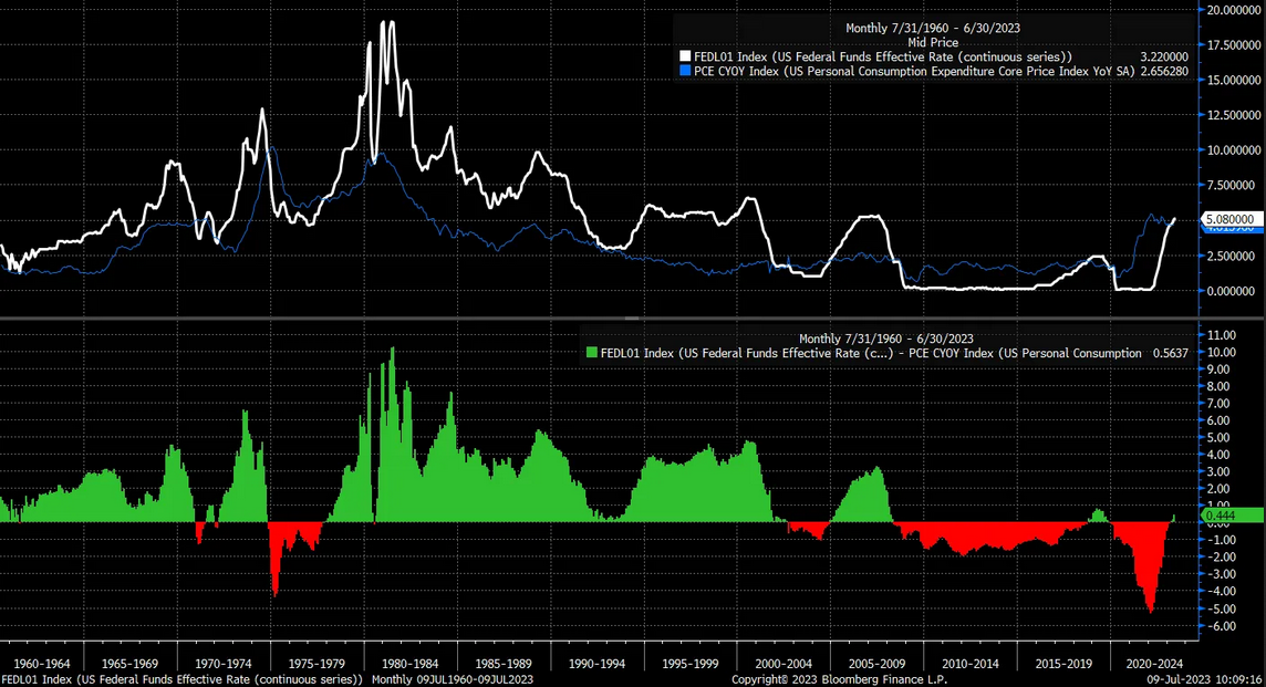
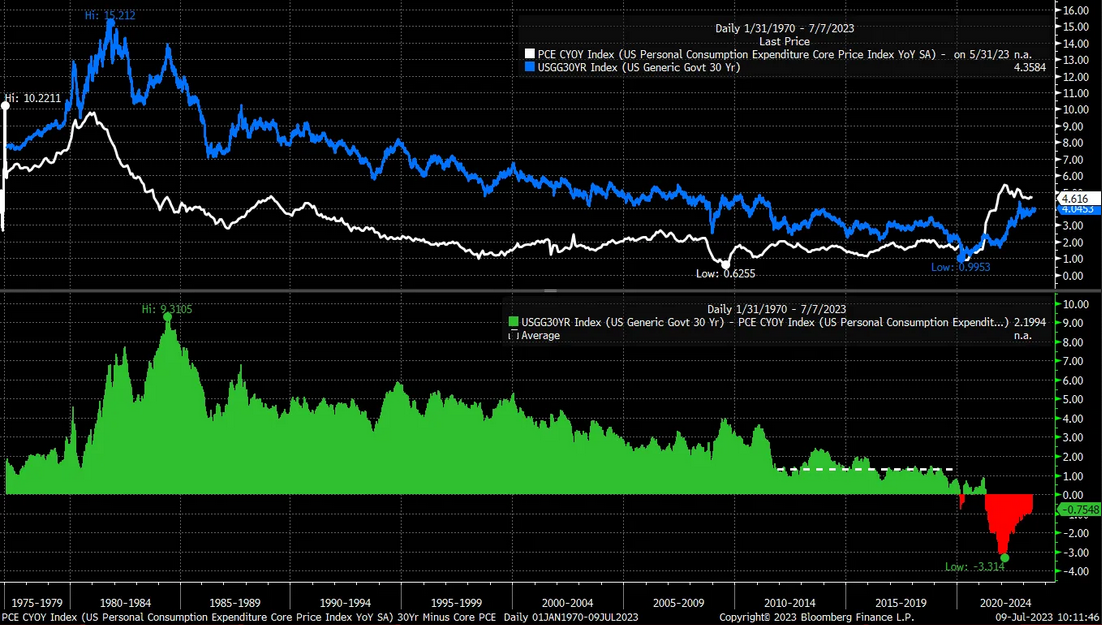
The June dot plot from the Federal Reserve indicates the potential for two more rate hikes. However, I believe there is a possibility that we may see more than two additional increases, with the terminal rate potentially reaching around 6%. In virtually every rate-hiking cycle since the mid-1970s, the Federal Funds rate had to exceed the core Personal Consumption Expenditures () rate to suppress inflation effectively.
In most instances, the Federal Funds rate had to surpass the core PCE rate by almost two percentage points. Assuming the core PCE rate declines somewhat further, a 6% Federal Funds rate doesn’t seem overly ambitious.
Moreover, the rate currently trades significantly below the core PCE inflation rate. In my view, the 30-year also needs to increase, potentially into the 5% range, to accurately represent this environment of higher inflation rates.
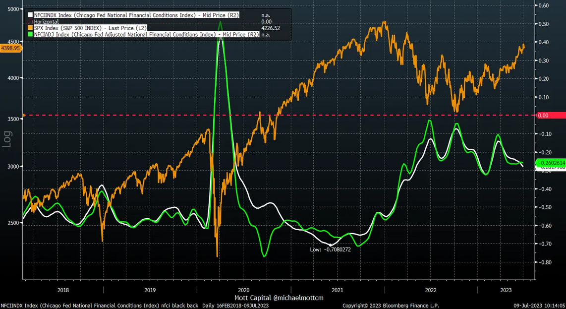
Currently, rates are not sufficiently restrictive, and financial conditions are accommodating, failing to impose a substantial drag on the economy. The Chicago Fed’s National Financial Conditions Index has significantly relaxed since mid-March, which has contributed substantially to the surge in the equity market.
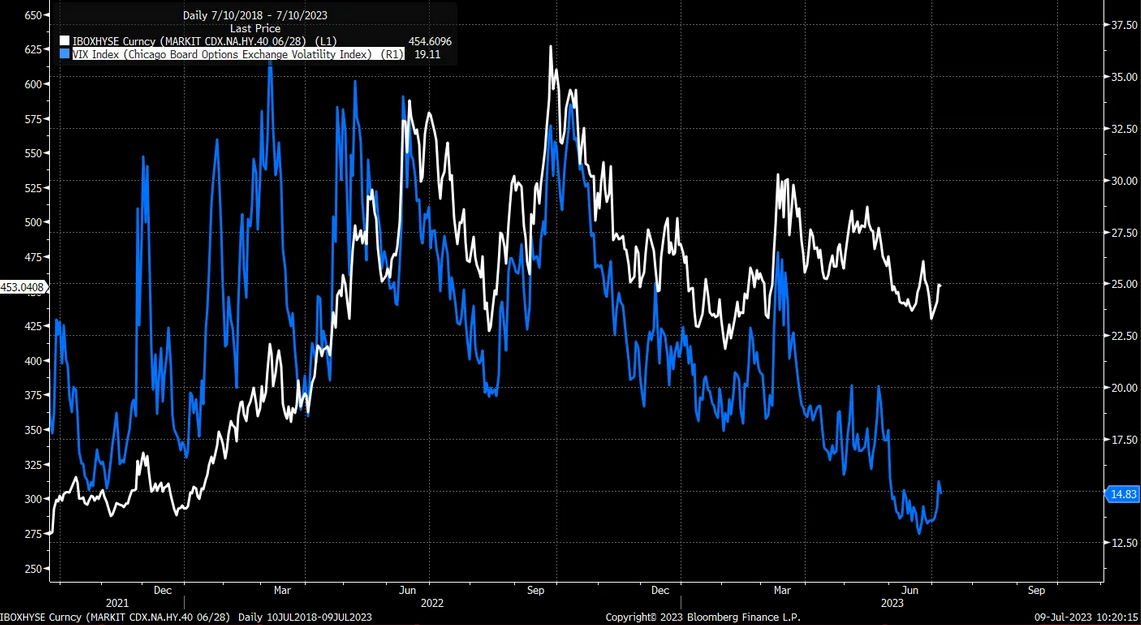
What the Federal Reserve indeed requires is assistance from the bond market. Specifically, it needs the rates on the back end of the yield curve to increase and spreads to widen. These changes will aid in curbing economic growth and decelerating inflation. However, wider spreads will result in higher implied volatility, leading to a decrease in equity prices. There were initial signs of this occurring this week, with high yield spreads beginning to rise and a subsequent increase in the Volatility Index ().
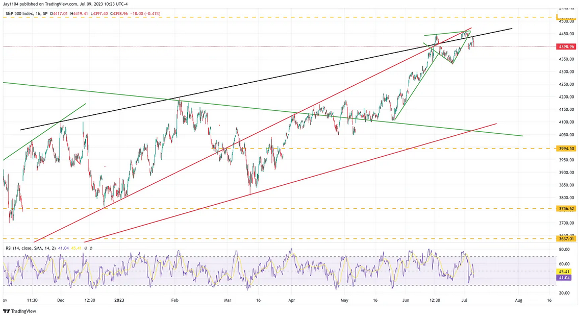
Naturally, these factors contributed to the week’s stock market sell-off, culminating in a lower close on Friday. The broke a long-term uptrend this week by creating a gap below it. A gap was also formed below a short-term uptrend. Generally, such gapping below trend lines is a bearish indicator, and a failed retest of the trend line typically signifies a trend reversal. To witness a substantial drop in the S&P 500 that pulls it back below the 4,200 mark, we would need the index to fall below 4,320.
The S&P 500 earnings yield has been drifting lower over the past several weeks as prices rise. This is opposite to what rates have been doing, which is rising. The spread between the S&P 500 earning yield and the rate is now negative. This means that the 2-year Treasury has a better yield than the S&P 500 does at this point.
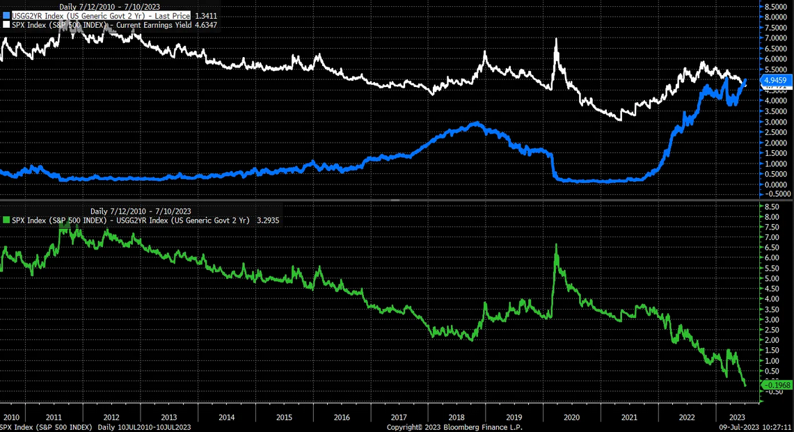
More crucially, the equity market has been behaving similarly to corporate or junk bonds, with the spread narrowing. If credit spreads start to widen again, we can anticipate the same for equity spreads, meaning lower prices.
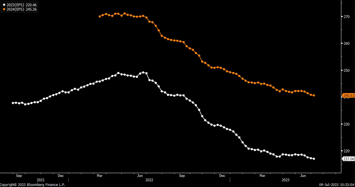
In essence, stocks have been banking on falling rates and a potential Federal Reserve rate-cutting cycle. At this juncture, it seems evident that this was a miscalculation. Earnings estimates have not improved to justify the recent market rally, but they haven’t deteriorated either, meaning there’s no reason why stocks couldn’t revert to their levels from early March.
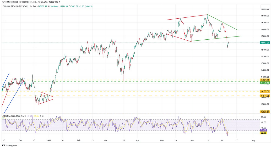
Markets globally are starting to roll over and look very weak suddenly. Just look at the , breaking down this past week and falling out of a diamond pattern.
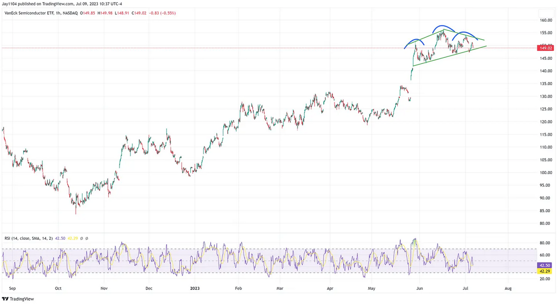
Moreover, the Semiconductor ETF also demonstrates signs of weakening, indicated by a potential head and shoulders pattern that is forming. There is a substantial gap to fill around the $130 mark, which could be a level the VanEck Semiconductor ETF (NASDAQ:) reaches over the ensuing weeks.
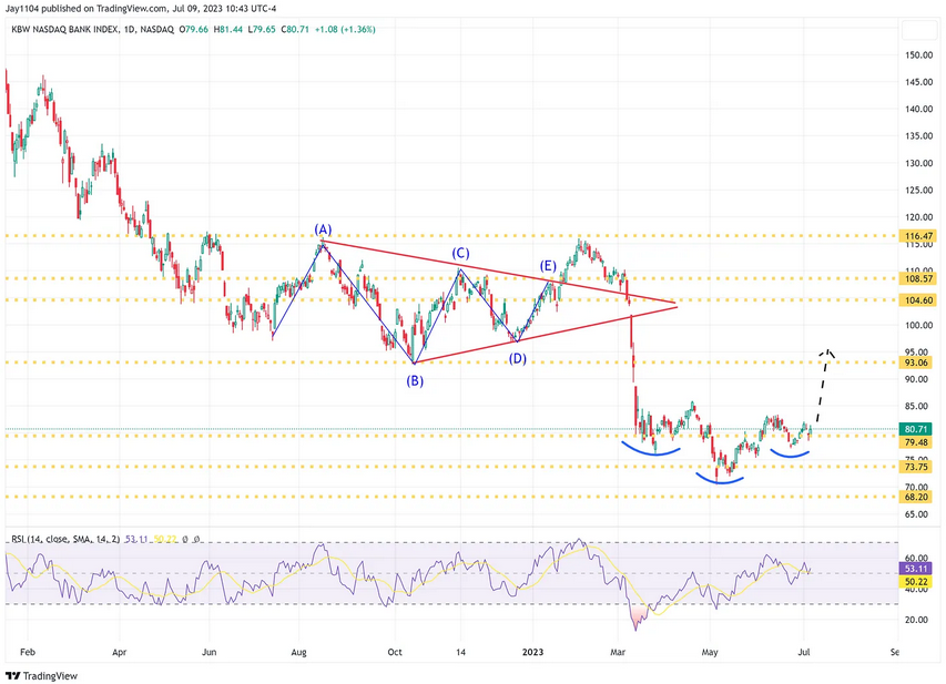
This week will also spotlight bank earnings. Interestingly, the appears to have formed an inverse head and shoulders pattern. Could this suggest the banking “crisis” is coming to an end? However, when a head and shoulders pattern fails, it typically acts as a continuation pattern, which is a complex situation for banks. So really, the BKX needs to push higher from here to confirm that reversal pattern.
This Week’s Free YouTube Video:


