The stock market appeared confused yesterday, reacting to the weekly and data as if the report had come in 0.4% cooler than expected. The market has been trying to push higher since Monday’s sell-off, and although it failed on Tuesday and Wednesday, it succeeded yesterday.
If every Thursday is now going to be treated like a CPI report, we should brace ourselves for a bumpy ride. Initial jobless claims data is volatile and often sees weekly revisions. The fact that continuing claims are rising and initial jobless claims missed estimates by 7,000 isn’t something to get overly excited about. The upward trend in jobless claims since December remains well-defined.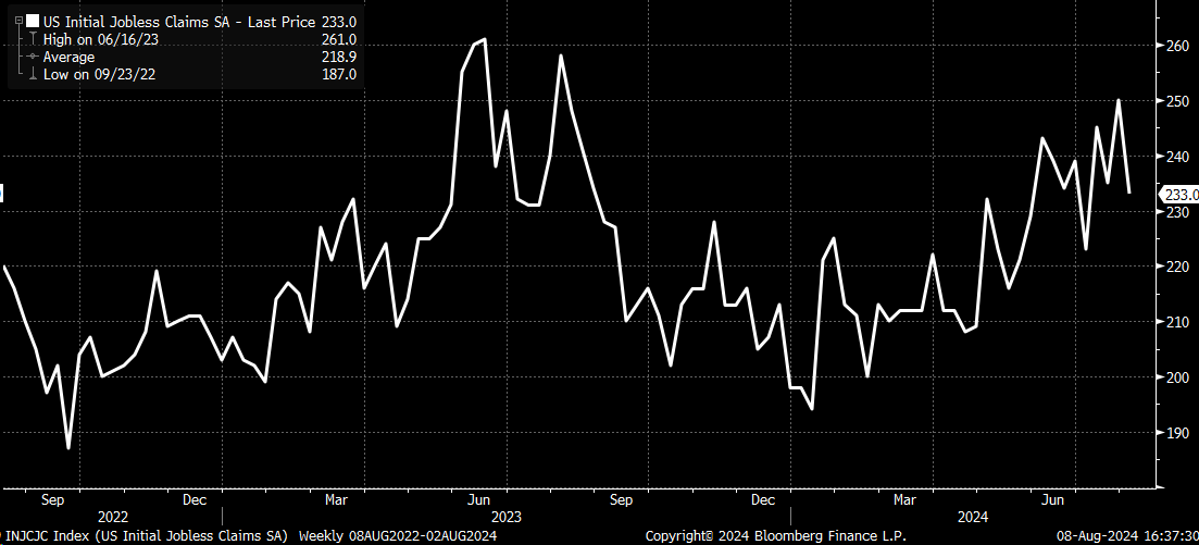
Meanwhile, continuing claims rose to their highest levels since 2021, which was a period when claims were declining. This data isn’t something that should be celebrated, nor does it hold significant meaning in the long term.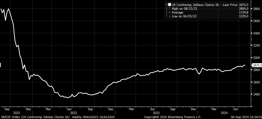
S&P 500, Nasdaq 100 in a Bear Flag?
Despite their efforts on Tuesday and Wednesday, futures traders finally managed to push the market higher in a low-liquidity, wide-spread environment. This momentum helped carry the market upward. However, the has merely traded within the range of last Friday’s close and Monday’s low, which feels more like consolidation than a genuine rally.
Additionally, yesterday’s gap opening has created an unstable pattern that tends to fill, much like the gap opening observed on Wednesday.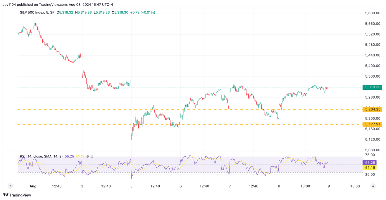
If you wanted, you could argue that the movement is part of a bear flag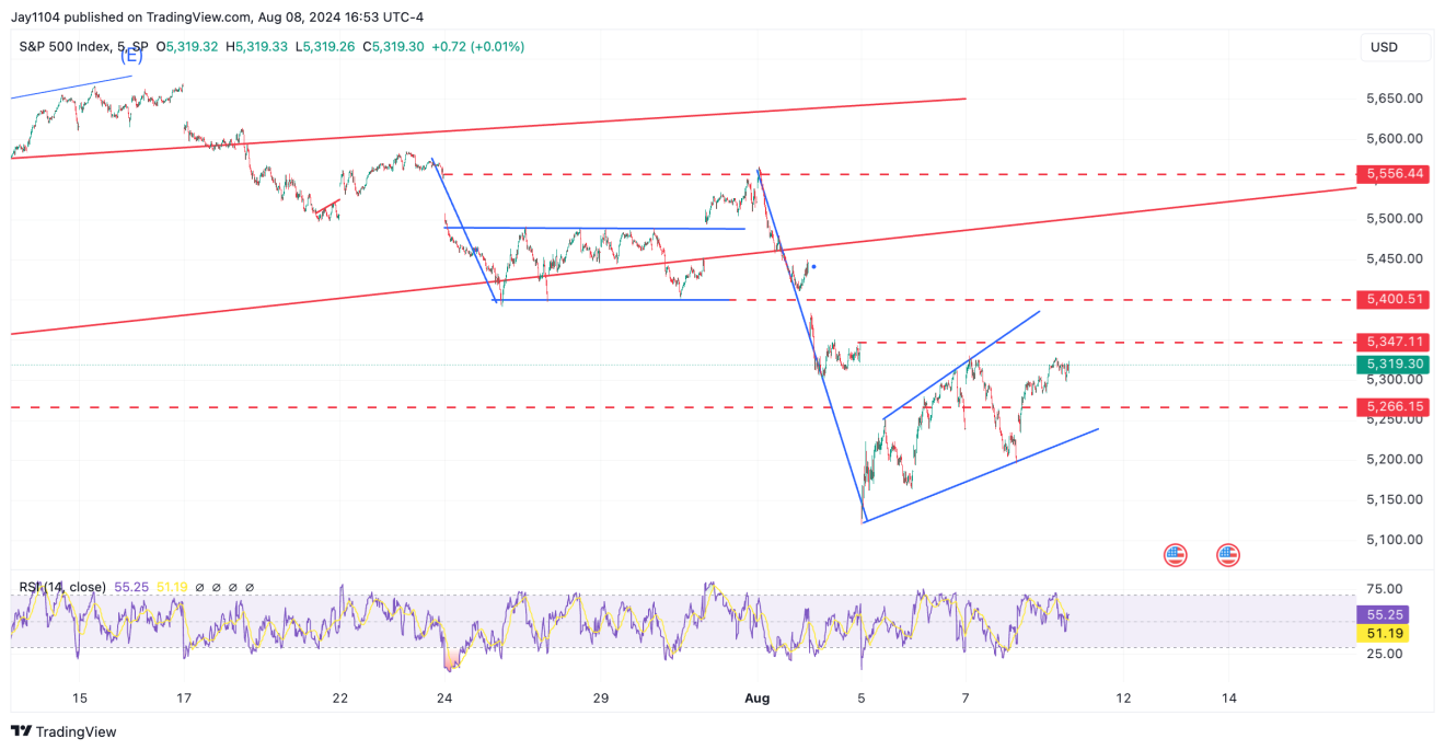
The pattern in the is the same and even looks better when drawn than the bear flag in the SPX.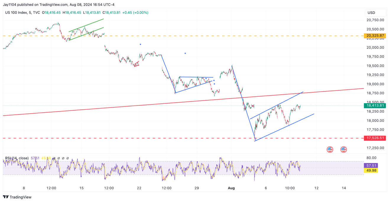
USD/JPY, AUD/JPY Could Continue Lower
You could say the same thing about the currently. It almost looks like the flag has been broken and is now being retested.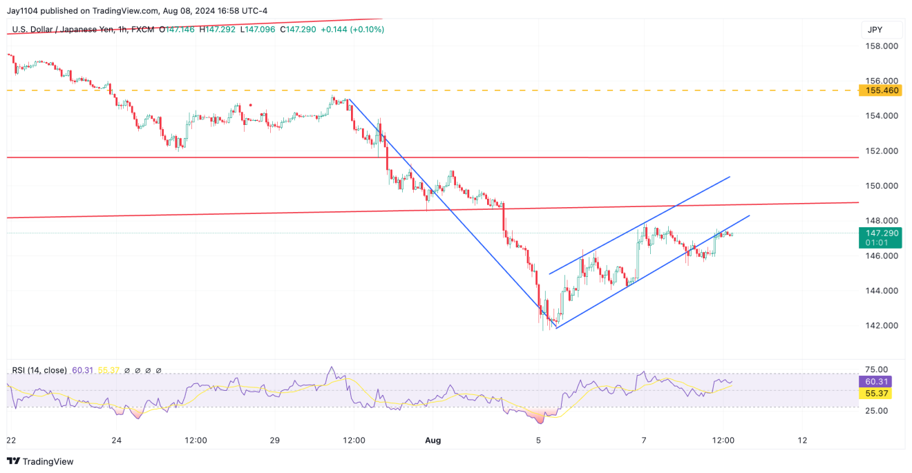
The USD/JPY isn’t even oversold anymore. It has come back inside its lower Bollinger band and consolidated some. So, if the USD/JPY wanted to continue to lower, it certainly could and wouldn’t find support until around 142ish.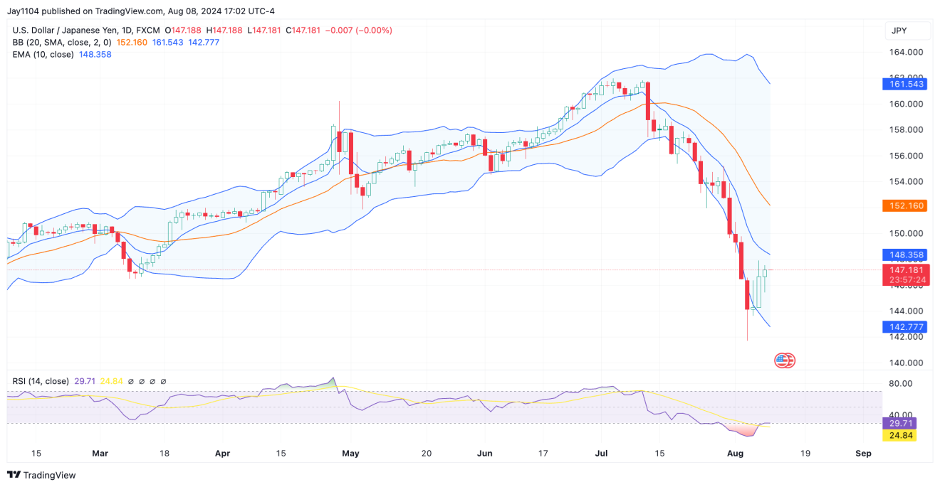
A big and important tell will be the , which has now moved back inside its lower Bollinger band and is trading just below its 10-day exponential moving average.
As long as the exponential moving average serves as resistance, it tells us that the direction for the AUD/JPY and the rest of the risk-asset world is lower.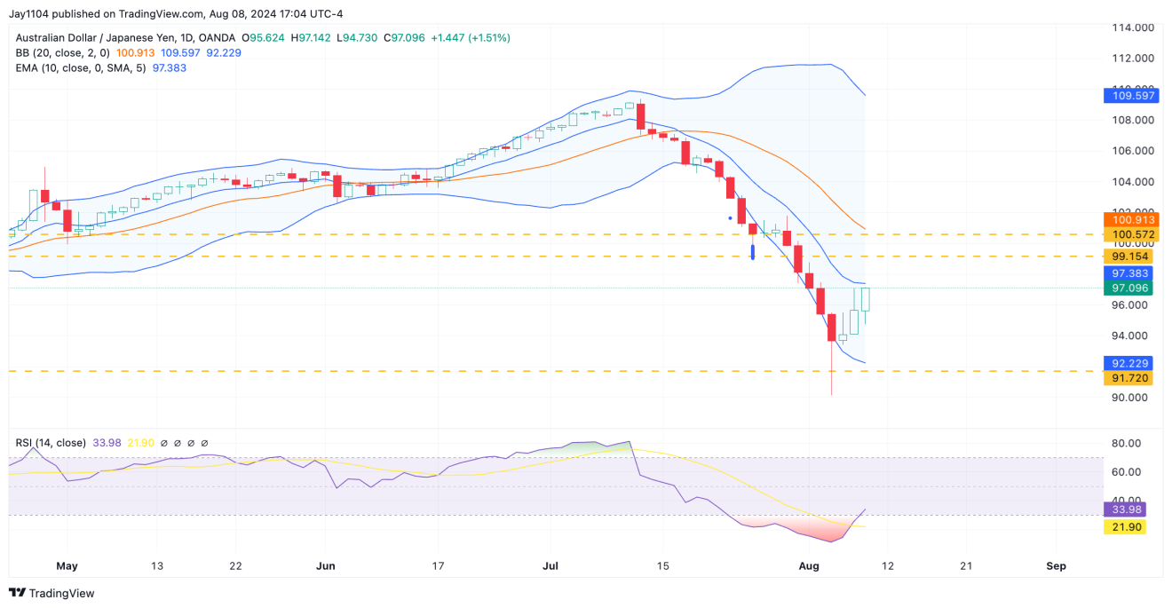
Semiconductors, 2-Year Treasury Move Back Into Bollinger Bands
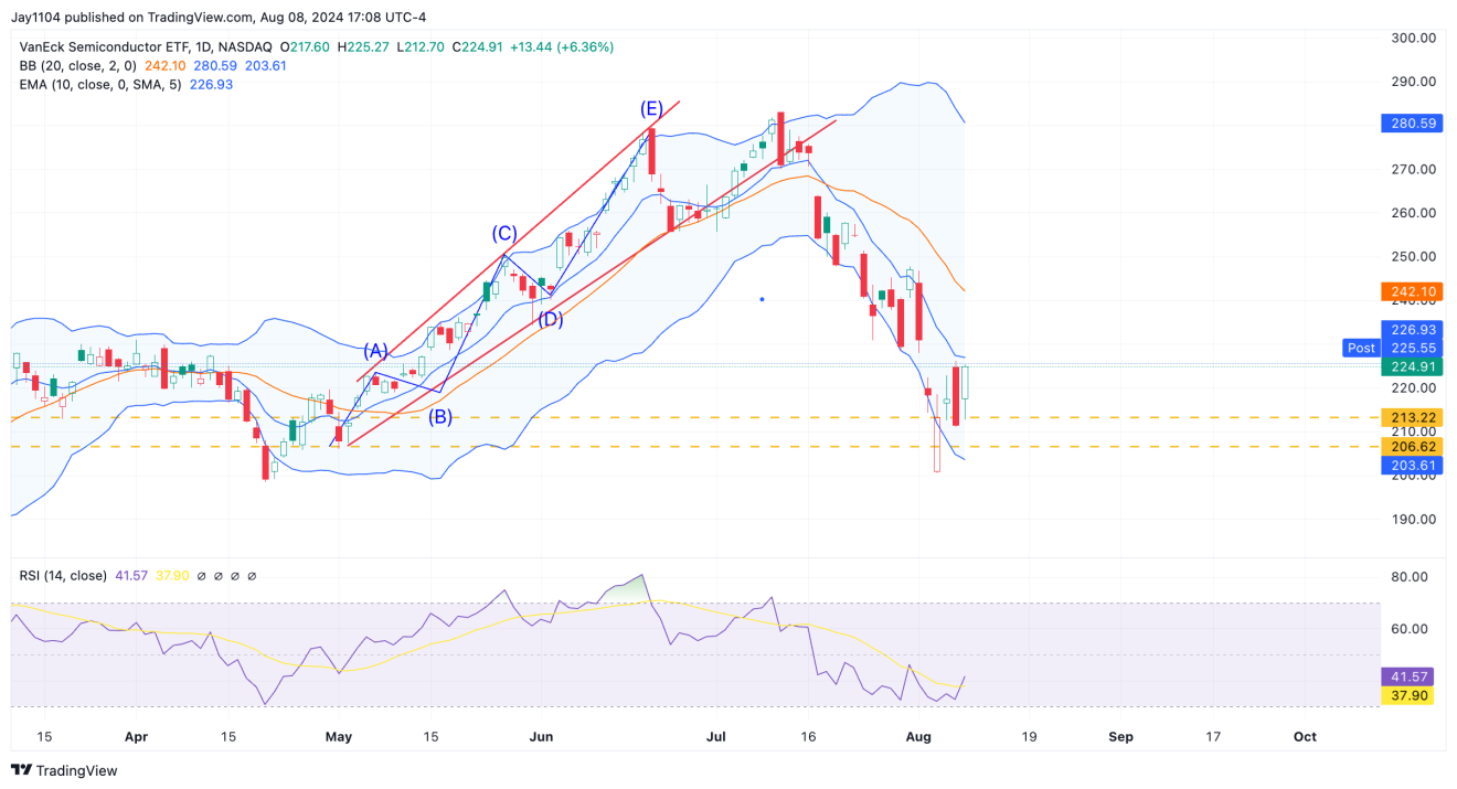
It is the same story for the , which has moved back into Bollinger bands. Honestly, the SMH could rally back to the 20-day moving average, in the $240s, and have it not mean anything because it is how oversold this market was and how quickly it dropped.
It is the same result in the .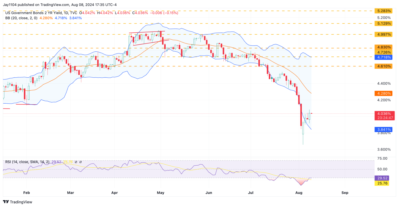
At this point, this seems like a lull in the carnage that has ensued since mid-July. One week of jobless claims data is not sufficient at this stage.
Significant shifts in the yield curve and across the FX space have occurred, which are too significant to ignore. It’s premature to say that everything is fine and has returned to how it was before.

